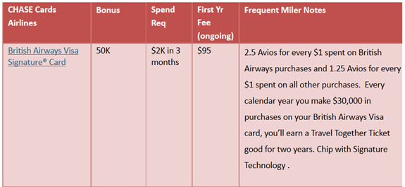
Since I began blogging full time in early 2012, I’ve maintained my Best credit card offers page. The purpose of the page is to list, in one place, all of the best available credit card signup offers. I put all of the info into tables in order to make it easy to see key information at a glance: signup bonus, bonus requirements, annual fee, etc. The problem with this approach was that I had to jam a lot of information into a very small space. So, I made the font small and did the best I could. Here’s an example of what the table used to look like:
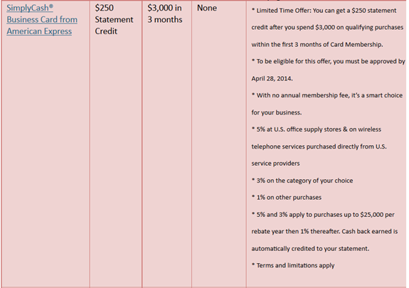
That wasn’t so bad, except when I had to fit in a lot more text. For example, I was required to include the full marketing bullets on this one:
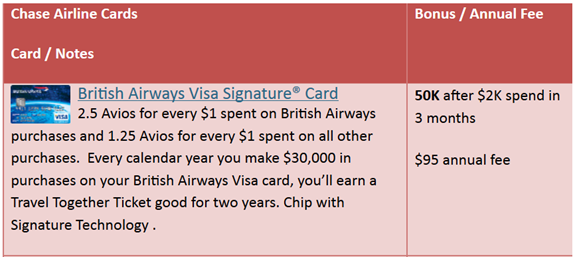
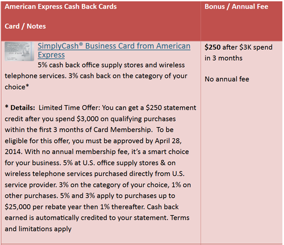
Well, that was ugly, unwieldy, and difficult to read. So, I increased the font a bit, swapped things around, and added images. Here are the same cards in the new format:
As you can see above, the new format allows me to include the same information (or more) with a bigger, easier to read font in roughly the same amount of space as was used before.
Mini reviews
With the old format, I had very little room to write what I thought about the card. With the new format, there’s a bit more room. Going forward, I plan to add “mini reviews” where I’ll say things like “Small signup bonus, but great category bonuses for everyday spend” or “Decent signup bonus. I don’t recommend using this card for day to day spend, but consider keeping for the annual free night.” I’ll also link to relevant blog posts when I can. This is a work (barely) in progress at this point.
Better navigation
The Best credit card offers page is quite long and its easy to get lost when scrolling around in it. To help with that, I’ve added two levels of “jump to” hyperlinks. After every section, you’ll see text that looks like this:
Jump to: Chase, Amex, Citi, Barclaycard, US Bank, BofA, Other
On the real page, the underlined words are hyperlinks that will jump you to the beginning of the offers for each bank. For example, click “Citi” and the page will scroll immediately to the top of the Citibank offers.
With Chase, Amex, and Citibank, the offers are further subdivided into offers for bank point cards (Ultimate Rewards, Membership Rewards, and ThankYou points), airline cards, hotel cards, and (Amex only) cash back cards. To help you find each of these, jump to the bank you’re interested in, then look for something like the following:
Also see: Amex Airline Cards, Amex Hotel Cards, Amex Cash Back Cards
Once again, these are hyperlinks that will move you to the appropriate section. So, if you’re at the top of the page and want to see Amex Cash Back cards, simply click on the Jump to Amex link, then click the Amex Cash Back Cards link.
If all else fails, use your browser’s search in page functionality to find what you need.
Better disclosure
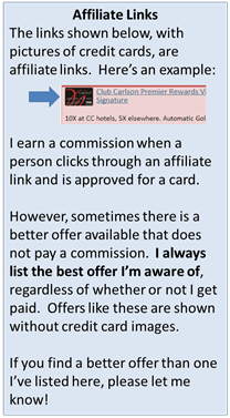
Another change I made was to make my affiliate link disclosure more visible. Previously, I mentioned at the top of the page that some of the links were affiliate links, and I had itty bitty text at the bottom of the page that declared that for many of the links I would get paid. However, there was no easy way to tell which of the links I was paid for. Well, I still have the same itty bitty text at the bottom, but now I have a big banner at the top to make things obvious:
In addition to the banner, I added a credit card image next to each of my affiliate links. That way, readers can see at a glance which of the links are affiliate links and which are not. My goal is to always share the best available link regardless of whether I would earn a commission.
Reader reactions
What do you think about the new format? Is it an improvement? What else can I do to make it better?


I am regular reader, how are you everybody? This paragraph posted at this
web site is truly good.
Nice job as always, Greg. BTW, I disable AdBlock for your site. Those ads are here for a good reason.
Greg
All looks good/ better……One thing I respect about you and your daily blog, minimum pimping, maximum research. You are one of 2 or 3 that I use , mainly because you do not over hype and , you do respond to questions that are asked of you……with the best answer you can provide
[…] Better Best Offers […]
[…] made was to make my affiliate link disclosure more visible. Previously, I mentioned at the top of the page that some of the links were affiliate links, and I had itty bitty text at the bottom of the page that declared that for many of the links Read full article […]
Great work Greg. Your transparency is the reason I favor your affiliate links.
Anybody remember the song “I Wish” by Skee-Lo? Ha ha. I wish I had the time to create my own spreadsheet. One that would allow for options:
Does it have a foreign transaction fee? Y/N/Doesn’t matter
Does it have an annual fee? Y/N/Doesn’t matter
Does it have EMV technology? Y/N/Doesn’t matter
Does it provide rewards? No/Points/Cash back/Doesn’t matter
And whatever criteria is important. A fully comprehensive list would take a long time, but I wish I had the time to do it.
I didn’t see the Amex Delta Airline Card. I received a 50K miles offer with a $1k spend. Is this an okay deal, or would you recommend a different airline miles card.
I do have Delta cards listed, but not a 50K offer. That is a good offer for that card. Are there better airline cards? Absolutely, but it really depends on what your needs are. If you fly Delta often, having a card that offers free checked bags and other perks is a good idea.
So looking at the links there are a bunch that are/aren’t affiliate links that do/don’t have CC images. Maybe you’re still updating?
As far as I know I updated all of them. Can you give me a couple of examples where it doesn’t appear to be correct?
Everything looks good now, must have been a delay somewhere.
hi, i always use your links and tell anyone i know to check your site to make sure they get the best offer. your honesty is why i give you my click. is there anyway to compile a list of the banks according to where they pull your credit from? thanks
Thanks! Banks pull from different bureaus in different States and sometimes differently by card. You can search other peoples’ experiences here: http://creditboards.com/forums/index.php?app=creditpulls
Greg:
How about indicating which of the offers is about to expire? I know you don’t always know that, but could be helpful to people looking to get new cards. Maybe a “Best of the best” at the top and “Expiring Soon” right after that.
Good suggestion. It is rare for me to know when an offer is about to expire, but yes when I do know, it makes sense to highlight it as you suggested.
Adblock seems to block the affiliate link images so users that use adblock won’t be able to differentiate the affiliate link. I would suggest hosting a local copy of the images or use some other flag for disclosure.
Crap. Maybe I’ll make it so that the card name is not clickable whenever it is not an affiliate link since I did it that way in a number of places.
like it much better, would it be possible to include whether it is churnable?
That would be tough to do here
You are fabulous! Thanks for all your hard work!
Thank you!
Hey Greg, I like how you organized it a little better, though its hard to tell what you consider the “Best” credit cards, because it just seems like a huge conglomeration of credit cards, just organized into categories, rather then organized by how you value/rate them. A lot of the value of such a page to your readers (especially the new ones) will be in helping them select which cards hold the most overall value. Obviously that will be unique for each persons situation, but placing the ink cash with 20k points as the third on the list for the sake of organization, kind of takes away from the “Best credit card offers” page. It almost makes it seem like thats the 3rd best offer available, even though thats not your intention. Im not sure how you can resolve it, but that third column (with your notes) may help (and maybe even a grade that you give it, e.g. “A-“). Just a thought. Also, if you are forced to put details directly from banks (e.g. the one from amex about simply cash) then i would also disclose that plainly (“Directly from AMEX” or something like that). Otherwise, we will think you said stuff like “With no annual membership fee, it’s a smart choice for your business” which is a judgement/value call.
Hope that helps.
You made a number of very good points here.
1) Identifying the best of the best: I like Grant’s idea of having something at the top of the page to identify the best of the best. I also like your idea of grading the cards in some way. Its tricky though since a card can be fantastic for one purpose but crappy for another. Maybe I can come up with icons: bag of money = great signup bonus; wallet = great for spend; something else for great perks.
2) I like your suggestion about bank details. I immediately updated the SimplyCash row to say “Details from American Express” to try to make that clear. I’ll try to stick to something like that going forward.