Reading Greg’s post this morning about the Marriott properties to book before the coming devaluation (See: Book these category 5 Marriott hotels before it’s too late) probably has some people reconsidering the value of their Marriott Rewards Premier credit card now that the annual free night certificate is losing a number of Category 1-5 options. That had me taking stock of my credit cards, and I couldn’t help but consider how they look, even if that isn’t the most scientific means of comparison.
Surely, credit card companies spend a lot of money with marketing firms on the physical design of their credit cards and the cart art that graces them — some spending more than others, with heavyweights like the Ritz-Carlton Visa Infinite keeping my wallet difficult for a pickpocket to lift. I know that when I started on my rewards card journey, I couldn’t wait to have a sleek Sapphire Preferred in my pocket, without anything but my name and that deep blue prism-look on the front.

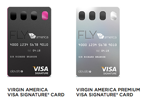
I won’t lie, there was part of me that wanted a Virgin America card just for the way they boldly decided to print the front in the wrong direction.
Then there have been some all-out fails. Citi Prestige, I’m looking at you and the way you thought you’d be hip by printing the magnetic stripe on the front of a card with a black background, leaving me to try to convince people that there really was a stripe and it was on the front and no I wasn’t a card thief printing multiple stripes in every which direction. Thank goodness I was already married when the Prestige card came out — I’m not sure that I would have gotten many second dates given the frequency with which waiters would come back to sheepishly say, “Sir, your card isn’t going through.”
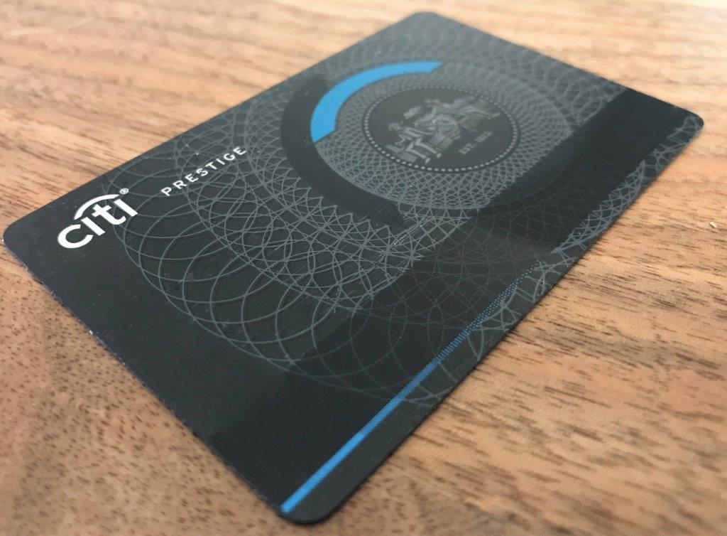
Citi eventually realized how dumb that was and redesigned it with the stripe on the back where it belongs. They even got with the program on issuing a metal card (or at least a piece of metal sandwiched in plastic), the new status quo for a $450-per-year card.

Design flaws aside, all of the above cards share one common feature: they all have the name of the card printed on the front. That seems pretty basic, doesn’t it? If you’re going to go through the trouble of paying a marketing team and an accounting team to collaborate on designing a card with a set of marketable benefits, it’s reasonable to think that you want people to know what the card is, right? In the case of the Prestige card, I can’t help but think that the purpose behind putting the stripe on the wrong side was specifically to make the card a conversation piece — and what good is that conversation if it doesn’t give the card a little bit of advertising, right?
Apparently, American Express looks at things a bit differently. Check out two of my new American Express Hilton cards — one of them is the Ascend card and one is the Aspire card. Which one is which?

At the grocery store the other day, as I was making conversation with the cashier and typing in my loyalty number, I glanced down at my wallet to pull out the Ascend card (since it earns 6x at the grocery store), and I very nearly paid with the Aspire. And I write about credit cards and miles and points for a living. I can think of several family members who would constantly pay with the wrong card and/or just not be able to remember which is which.
Really, Amex? Is that the best you can do to differentiate these? Don’t get me wrong — I’m thrilled with the benefits of the Aspire card, especially in comparison to the way that Marriott’s latest devaluation has hampered the value of the annual Category 1-5 certificate that comes with the Marriott Rewards card. In fact, it’s hands-down my new favorite hotel card. I just wish I could easily tell which one is my favorite when I look down at my wallet.
Is it unfair of me to compare a $450-per-year card with an $85-per-year card? Maybe, but I’m happy to pay $450 per year for $500 in credits and an annual fee night valid at nearly any Hilton property. But is it too much to ask for Amex to print the name of the card on the front? If they aren’t going to print the name of the card anywhere, at least make the effort to use distinctly different color schemes. Apparently, Hilton is giving out so much value on the Aspire card that they couldn’t afford to also pay for different colors of ink to adorn the front.
I’m sure that Amex isn’t banking on many people carrying both cards — after all, only Hilton die-hards would want to carry two different Hilton cards, right? Delta must be different. Delta fliers get a Blue card, a Gold card, a Platinum card, and a Reserve card — each featuring a distinct color….and the names printed on them. Charge card members get Green, Gold, and Platinum colors…and the names printed on them. “Everyday” customers have perhaps the most difficult task in terms of differentiating cards — though even then, the word “Preferred” does appear on the front of the Everyday Preferred.
Don’t get me wrong…I’m not wishing for Hilton to waste money on more ink at the expense of the generous set of benefits on this card. But did they really have to print the words “American Express” on the front twice without printing the name of the card once?
Call me old fashioned, but I hope Amex reconsiders the design for future iterations of this card. In the meantime, I look forward to finishing my minimum spend and collecting my latest 100K points. Hopefully, I’ll spend on the right card.

")

I had some fraud issues and had to get a new Ritz card. The new card arrived today and believe it or not, the original metal card (I believe) is now PLASTIC! A $450 a year card and it is indistinguishable from a free cc. Geez, Chase/Ritz.
I’ve had both metal and plastic replacements on the Ritz card.
Hi Nick, It was the same with the no fee Hilton and the Surpass too. I’d tell my hubby to use the Surpass at the grocery store, and he’d say “The Hilton, right?” I was losing my patience until I looked at both cards and – no names! I put labels on them.
True — but at least the Surpass was grey and the no-fee was blue. You could make up a mnemonic — grey for grocery shopping day. Whatever you do, don’t use blue! But with these new ones, they look so darn similar. Labels are a good idea.
Love the mnemonic. I’m not that clever. Plus too much work for him. KISS
nick. finally. someone is smart enough to write a post about this. holy shit. you gotta give this post more visibility. since AMEX RAT has so much time to read blogs, I want them to see this comment and this post. this is not some random “personal preference” element. AMEX absolutely fukd this up. big time. the marketing and design team were high on BS when they finalized this trash. they should all be fired. I actually called AMEX to complain about this like a big jerk off because when I got my HH CCs, i was thinking WTF…
AMEX just won an exclusive contract and you create 4 damn CCards that look exactly the same? WTF are you thinking dude. put some Olympic level of creative detail on that crap.
So you have 2. well, i have ALL THREE amex HH cards. its a damn color gradient from light blue to dark purple with no CC name on them. SO stupid. but do you know whats even worse? the light blue no AF HH CC is just simply called AMEX HHONORS CC! WADAFWAK? it has no name dude! BUT they are ALL Amex HH CC! why would you call the no AF CC just “AMEX HHONORS CC”? They already have a theme of “A” on the other 2. Aspire and Ascend. Wheres the 3rd A?
I would call it “AMEX HH CC ACCIDENT”.
My favorite is Wells Fargo because they let me put my own pictures on the cards. I have pictures of me and my daughter in places that I have been like the Grand Canyon or at the beach background. It also is an advantage as the checker looks at the card and can instantly see that it is my card as my picture is on it. Also has the conversation starter element to it.
I wish more cards would add this. I could carry around all my pictures
Sam
Capital One also allows you to use your own picture. I also have one with a picture of my wife and I with funny expressions that usually gets a laugh on the rare occasion that I use it.
hey nick, when you got ur apire CC, did you also get it in just a plain white envelope? thats how i got it. its an AF of $450 man! wheres the nice nice nice Plat or CSR box!? do you know how the Delta Reserve CC comes? in a box?
Why are all credit cards blue? Years ago, I had a Disney Visa that was RED, and I loved it for nothing else that it was easy to pick out of my wallet! The SPG card used to be a little different looking, but even that turned to the same generic blue.
Anyone remember some Citibank credit cards printing face pics on the card? Almost looking like a visa ID/CC card. Wonder why they got rid of that
Love this article. Remember getting comments on my old Amex blue cash card when unique designs like that clear card were much less common.
Noticed the contactless symbol on the Hilton cards. Is that something you requested or is it standard on these? Not much use here in the US, but would have loved a contactless card when using the Tube in London, would have saved some time getting an Oyster card and then returning it for a refund.
It’s a standard feature on these cards. Would have been useful for me last year in Australia as well. Went to an outdoor cinema in Melbourne (like a drive-in, without the cars) and everyone was paying with contactless. Had a heck of a time finding someone with a pen so I could sign the receipt after I finally got the guy to put the chip in the reader.
Still waiting on my Aspire in the mail. Did not realize they were so close in design like that. Guess I will just keep 1 in the wallet at a time.
First world problems, I know.