As you know, we take pride in maintaining what we believe is the best credit card offers page on the web: Best Credit Card Offers. There, we list all of the best public offers we know of, regardless of whether or not we earn commission from those cards (in most cases we do not). But, up until now, that page was… how can I say this politely… butt-ugly.
Over the past few weeks we’ve been working towards making our credit card displays better. Not only were the card displays ugly before, but they were virtually unreadable on smartphones. While we’re still working on a few tweaks, we’re pretty much there. The new format is live on our Best Credit Card Offers page and will soon be live on all pages that display credit card information.
Here’s what’s new:
- Better looking, especially on mobile! (see below for examples)
- We now show our estimated first year value on the Best Offers page. Click the value for details of how these estimates are calculated.
- Better organized: All information about the welcome bonus is now grouped together in a gray box. Below that box is information about the card itself (not just the bonus).
- Modular design: This doesn’t really help the reader, but it will help us tremendously. An example is with our Top 10+ pages. There, instead of showing the full details about each card, we can show just the signup bonus information. This way, it is easier to compare across cards since each one takes up less vertical space.
- Click for more details (coming soon). This is not yet fully implemented but the goal is this: Each card will have a dedicated page with a lot more information about the card perks, rewards, signup details (Are you eligible for the bonus? How to get approved? etc.), whether to keep or cancel, and so on.
What follows is a quick “before and after” show and tell. First, here are images (which won’t respond to the width of your device):
Before (Desktop View)
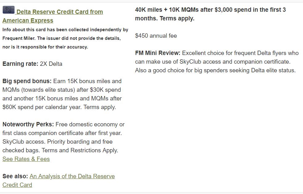
Old Smartphone view is not shown. Trust me, it was bad.
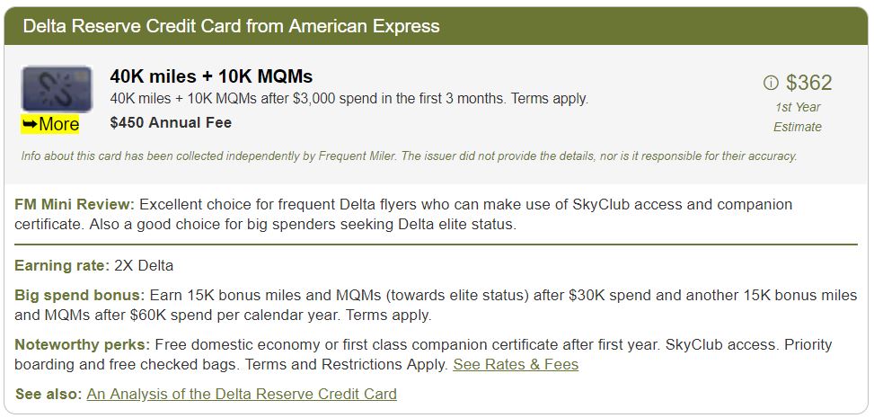
New Desktop View
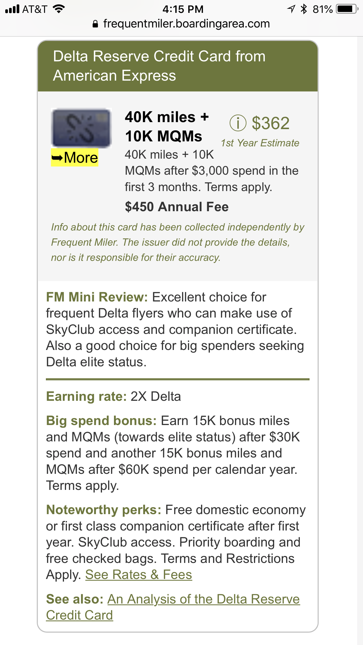
New Mobile View
Real Life Views
Here’s the same card in the old and new view dynamically rendered. Please view this in a web browser rather than an email client or rss reader as I have no idea how the displays will look in those cases. Note that these will look different depending upon whether you view them on a desktop browser or a smartphone:
New:
| Card Offer and Details |
|---|
60K Miles ⓘ Affiliate 60K miles after $5K spend in first 6 months. Terms apply. (Rates & Fees)$650 Annual Fee FM Mini Review: Excellent choice for frequent Delta flyers who can make use of SkyClub access and companion certificate. Also a good choice for big spenders seeking Delta elite status. Earning rate: 3X Delta Card Info: Amex Credit Card issued by Amex. This card has no foreign currency conversion fees. Big spend bonus: Earn 1 Medallion Qualifying Dollar (MQD) per $10 spent Noteworthy perks: 15% off when using miles to book an award flight (Delta metal only) ✦ Annual $2,500 MQD Headstart ✦ Domestic, Caribbean, or Central American economy or first class companion certificate (subject to taxes & fees) after card renewal ✦ SkyClub access (starting 2/1/25, 15 visits per year (after 15 visits have been used, additional visits can be purchased for $50 each) or to earn an unlimited number of visits each year starting on 2/1/25, spend $75K or more on eligible purchases between 1/1/24 and 12/31/24, and each calendar year thereafter. ✦ 4 Delta SkyClub one-time guest passes ✦ Centurion Lounge access when flying Delta ✦ Earn up to $200 as a statement credit each year after booking prepaid hotels or vacation rentals with your Card through Delta Stays on delta.com/stays ✦ Up to $20 per month in statement credits on eligible purchases with U.S. Resy restaurants [enrollment required] ✦ Up to $10 per month in statement credits for purchases with select rideshare service providers [enrollment required] ✦ Complimentary upgrades ✦ One statement credit every 4 years for the $100 Global Entry application fee or one statement credit every 4.5 years for the $85 TSA Precheck application fee ✦ Priority boarding ✦ First checked bag free on Delta flights. ✦ Hertz President's Circle Status ✦ Terms and limitations apply. (Rates & Fees) See also: Delta Reserve complete guide |
What do you think?
Please comment below.
[…] Better Best Offers […]
Looks good!
One suggestion. Make it more obvious where I should click for the card.
I’m not understanding how you came up with over $800 for Citi premier offer.
50k points x 1.25 cents= $625. Also annual fee, possibly waived first year. I see the partners and they don’t have incredible point values either to transfer.
Am I missing something?
Did you click through to the page that shows how it’s calculated? We use Reasonable Redemption Values, which for Thank You points are around 1.8 cents per point
Thanks, although 1.8 I’ve not gotten on anything but Hyatt redemptions via Chase transfers.
Also, I’d be more than interested in seeing the likability of qualifying for the bonus; e.g. “the card is subject to the 5/24” or other restrictions. I don’t notice them right now.
Can you change the color/ vommit green is out of style/ everyone likes blue/ imho
Love your site but agree I hate the green!
We are separately looking to do a site refresh with a new theme, including new colors. When we do that, the credit card page colors will change too
It would be great if you also included the LIFETIME BEST BONUS for each of the cards, along with the most recent date that the all time high bonus was last offered, and whether the lifetime best offer on the card was targeted, or a public offer.
It would be even better if you were able to list how often the lifetime highest offer has been available over the past year (ie was it a once-off for a short period of time, or something that is offered every few months).
That way your readers can quickly see how close the current offer is to the lifetime highest bonus offer on any particular card, and how long ago that offer was available so that they can quickly determine if it’s worth waiting for the offer to go up, or apply for the current offer.
If you include this information then there is no reason why anyone needs to use any other list or do the research to determine if the current offer is a good one or not.
Looks great. Thanks
Virgin Atlantic link doesn’t work fyi
Thanks! We’ll look to fix the VS link ASAP
Is it possible to have a chart for sign up bonus for each card? something similar to cashbackmonitor. Or other website already provides that info?
I’m not sure what you mean. Can you give an example?
Personal opinions:
Overall: good change. Space saving. convenience of mobile readers considered.
What to improve: still too wordy and messy. Since the page is all about information, fast and convenient info delivery is the key. Therefore, I recommend to use more bullets (like powerpoint) instead of long sentences or a paragraph. Note, the neat format should NOT come at the cost of information loss or ambiguity. Using Delta Reserve card as an example, here is what I would recommend:
=============================
FM Mini Review:
• Excellent for frequent Delta flyer using SkyClub access and companion certificate.
• Good for big spenders seeking Delta elite status.
——————-
Earning rate: 2X Delta
Big spend bonus:
• 15K bonus miles and MQMs after $30K spend
• another 15K bonus miles and MQMs after $60K spend per calendar year
Noteworthy perks:
• Free domestic economy or first class companion certificate after first year.
• SkyClub access.
• Priority boarding and free checked bags.
See also: An Analysis of the Delta Reserve Credit Card
===========================
The key tip is: use as few words as possible (as if you hated them). However, be concise but complete (yes, the editors should have some summary skills and be familiar with the topics). Some terminology that may be strange to new users should be explained elsewhere. Also, throughout the article, standardize your template and objective word using: e.g. {bad, so-so, good, excellent, 2G2BT}
BTW, I like the top navigation panel a lot (i.e. those bank names) since I always come to the page with a specific purpose in mind. I won’t look through everything but like to quickly jump to what I want, get a clue, and then leave.
A possible downside of using bullets is that since each bullet occupy a line, it may not be space saving. Your editors can think about it. However, I assume the reader’s goal is not to finish reading all the cards in shortest time, but quickly locate the information and build up a rough picture as soon as possible. In that sense, not the best space saving (=make the article look long overall) may not be a problem. Nobody should expect to read all the info at once.
A possible upside of using bullets (kind of digitize the info) and standard template is that you can make true comparison. There are many comparison websites around, but if you look closely, they are organized without thinking (soul). If you come up a good standard comparison format for credit card comparison (I suggest you to file a patent on it first before publish it), it will be very interesting. It can also answer lots of the questions like:
1. Premium card comparison: prestige vs CSR vs Amex platinum…
2. which card give me the primary car rental insurance.
3. Which card is best to use for large spending
4. which card is good for XXX store.
etc.
To answer all these questions with a single comparison function is very ambitious, but also unique. i don’t remember other blog website allows users to select and compare cards within their website yet. So if you can do it, you would be pioneers :).
OK, my overall suggestion is to implement bullet format first and then think about providing “Compare” option.
Thanks for the detailed suggestions! I’ll have to take time to think about these
Substantially easier to locate the card name and sign up info. Nice work!
Couple of suggestions:
1. An excel table with the card name, first yr value, bonus amounts, spend required, timeframe, issuer restrictions (5/24 etc). Would make it much easier to compare and sort.
2. Bullet point or line separate the big spend bonus, perks, etc. Easier to read.
Thanks!
1. I am thinking of providing a table view as another option.
2. The problem with bullet points / line separators is that each card then takes up a huge amount of vertical space which makes it hard to scroll around to find which cards you are interested in. We might be able to solve this with horizontal bullets
To touch on the comments others have made about space saving, I’m thinking that you may want to consider a “collapse all”/”expand all” button in the right side corner next to each card issuer, and also a “collapse”/”expand” button in the top right corner of each box, which could look like a simple +/- or “up/down” button. The purpose would be to accommodate those who want to browse the list vs. those who want to jump to specific sections, and would function the same way as collapsing and expanding replies to the comments section here. The expanded view would be the standard view of all cards as you have now, and if you clicked the “collapse all” button, it would shrink each box on the page (or within the category) to display just the name, graphic, and bonus details for more efficient browsing. You can then stop at any card while you’re scrolling, and if interested in more, click the “expand” button to display the mini-review, additional details, etc… Of course you could also make the collapsed view be the initial default view and make readers click to expand, etc etc…
I would also consider giving the titles of each section by card issuer (e.g, “Amex”, “Chase”) and sub-section by category (e.g., “Amex Airlines”, “Amex Hotels”) a stronger or bolder visual aspect, whether with bolder/center justified lettering, or some kind of outlining/highlighting… Now that each card has its own prominently-displayed box, the boxes are very easy to discern from the list, but because the category titles have not changed from the old layout, to my taste it makes their function as a category separator less apparent, and it also becomes less clear while browsing that I’ve scrolled from one category to the next.
New layout looks very nice.
Great work guys! You da man Greg!